728x90
728x90

이제 화면을 구현해 보는 단계입니다.

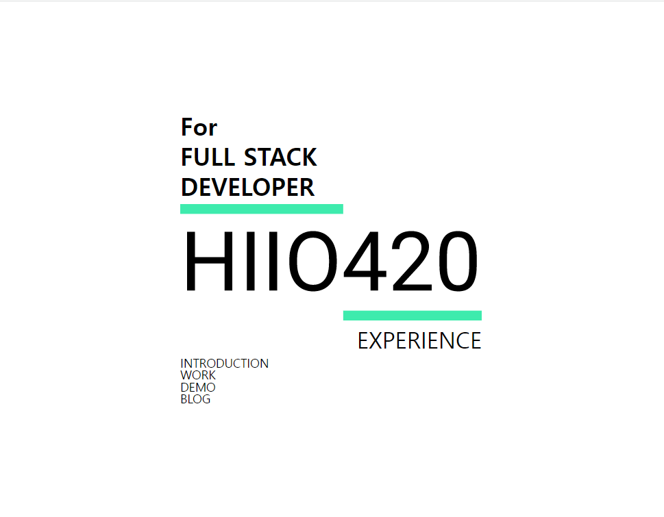
먼저 화면을 구현하기위해 작성한 화면 구성은 크게 로고 + 상단 텍스트 + 하단 텍스트 +페이지 링크 네비게이션 4부분으로 나눌 수 있습니다.


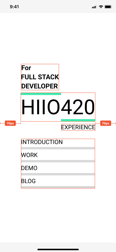
양옆으로 70px 정도로 padding이 있고 각 세로로 가운데 정렬이 필요합니다.

div id="main" 태그안에 id="intro" 태그를 추가하고 총 4개의 div 태그를 추가해 줍니다. 


1. 첫번째 div 안에 3개 div 를 추가해 주고 각각 FOR, FULL STACK , DEVELOPER 텍스트를 넣어 주었습니다.

2. 두번째 div 안에는 img 태그를 사용해 로고 이미지를 넣어 줬습니다.

2-1. 로고 이미지는 svg 파일로 resources 디렉토리에 저장 되어있어 import logo form ~~ 로 svg 파일을 불러와 

<img src={logo} alt="logo" /> 로 넣어 줍니다.

3. 3번째 div 안에는 1개의 div 를 추가하고 각각 EXPERIENCE 를 입력해 줍니다.

4. 4번째 div 안에는 4개의 div 를 추가하고 각각 INTRODUCTION , WORK, DEMO ,BLOG 를 입력해 줍니다.


// src/pages/Main/main.js

import logo from "../../resources/image/svg/logo.svg";

export default function Main() {
  return (
    <div id="main">
      <div id="intro">
        <div>
          <div>For</div>
          <div>FULL STACK</div>
          <div>DEVELOPER</div>
        </div>
        <div>
          <img src={logo} alt="logo" />
        </div>
        <div>
          <div>EXPERIENCE</div>
        </div>
        <div>
          <div>INTRODUCTION</div>
          <div>WORK</div>
          <div>DEMO</div>
          <div>BLOG</div>
        </div>
      </div>
    </div>
  );
}

CSS Style 입히기


이제 style을 입혀 볼 차례입니다. style은 css를 사용하려고 합니다. 

Main.js 와 같은 디렉토리에 main.css를 만들고 import 해 줍니다.

import "./main.css";


id="main" 의  스타일을 먼저 정의해 줍니다. 

너비는 100%로 하고, 높이는 현재 브라우저 높이의 크기만큼 주었습니다. flex 속성을 통해서 가로+세로 가운데로 정렬 시켜 줍니다.

/* src/pages/Main/main.css */

#main {
  width: 100%;
  height: 100vh;
  display: flex;
  justify-content: center;
  align-items: center;
}


id = "intro" 의 스타일을 넣어줍니다.

intro의 경우에는 main과 똑같이 flex 속성을 가지지만, flex-direction 값으로 column 을 주어 세로로 flex 속성 값들을 반영해 줍니다. 각 태그들의 사이를 8px 정도로 띄어줍니다. width는 100% 이지만, 400px은 넘어가지 않게 max-width 값을 주었고, 양옆으로 padding 70px 씩 입력해 줍니다.

/* src/pages/Main/main.css */

#main {
  width: 100%;
  height: 100vh;
  display: flex;
  justify-content: center;
  align-items: center;
}
 
#intro {
  width: 100%;
  max-width: 400px;
  padding: 0 70px;
  display: flex;
  flex-direction: column;
  gap: 8px;
}


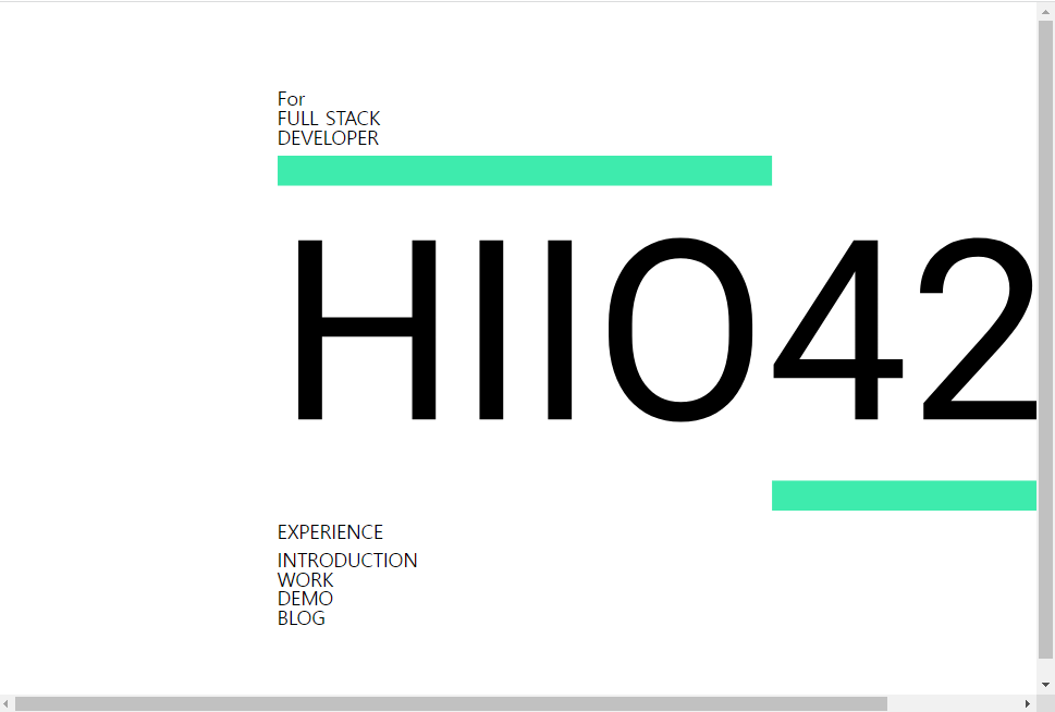
이미지 로고가 너무 크기 때문에 화면에서 넘쳐 스크롤이 생깁니다.

img 의 max-width 값을 100% 로 해서 intro의 너비에 맞게 맞춰 줍니다.

/* src/pages/Main/main.css */

#main {
  width: 100%;
  height: 100vh;
  display: flex;
  justify-content: center;
  align-items: center;
}

#intro {
  width: 100%;
  max-width: 400px;
  padding: 0 70px;
  display: flex;
  flex-direction: column;
  gap: 8px;
}

#intro img {
  max-width: 100%;
}


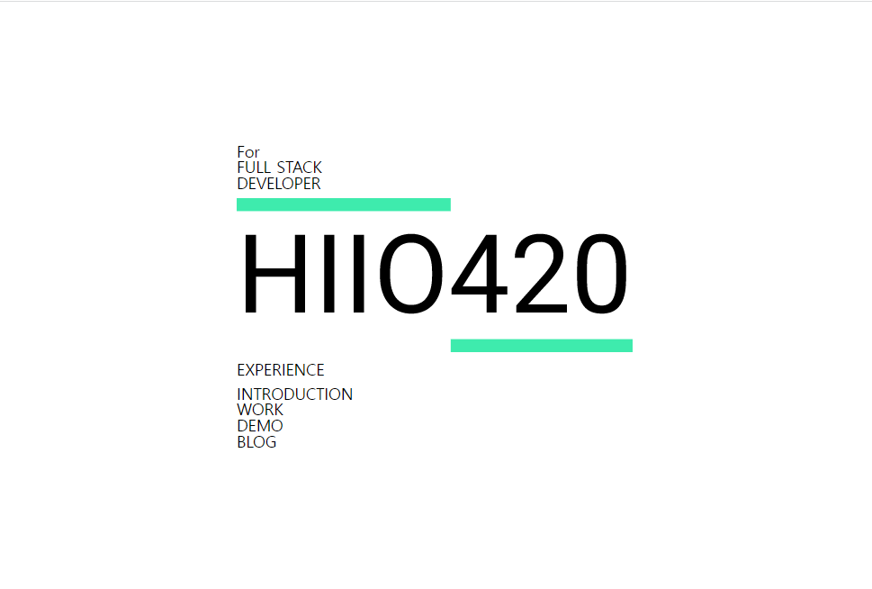
이제 이미지 로고를 기준으로 위 아래에 위치한 텍스트들의 스타일을 입혀야 합니다. 

이때는 따로 className이나 id 값을 부여 하지는 않고 nth-child 를 이용해 스타일을 입혀 보려고 합니다.


먼저 

1. intro의 첫번째 div를 선택해 주고, font-weigh,font-size ,display,gap 속성의 값들을 입력해 줍니다.

font-size의 경우에는 clamp 를 이용해서 모바일 - 데스크탑 화면 / 해상도 너비 별로 크게 벗어 나지 않게 입력해 주었습니다.

#intro > div:nth-child(1) {
  display: flex;
  flex-direction: column;
  gap: 8px;
  font-weight: 600;
  font-size: clamp(10px, 6vw, 32px);
}

3. 3번째 div 도 1번째 div와 마찬가지로 clamp를 활용해 font-size를 설정해 주고 text-align으로 오르쪽으로 정렬 시켜 주었습니다.


/* src/pages/Main/main.css */

#main {
  width: 100%;
  height: 100vh;
  display: flex;
  justify-content: center;
  align-items: center;
}

#intro {
  width: 100%;
  max-width: 400px;
  padding: 0 70px;
  display: flex;
  flex-direction: column;
  gap: 8px;
}

#intro img {
  max-width: 100%;
}

#intro > div:nth-child(1) {
  display: flex;
  flex-direction: column;
  gap: 8px;
  font-weight: 600;
  font-size: clamp(10px, 6vw, 32px);
}


#intro > div:nth-child(3) {
  text-align: right;
  gap: 8px;
  font-size: clamp(10px, 5vw, 30px);
}


이제 마지막 4번째 div 입니다.

4. 4번째 div의 경우 3번째 div와 간격이 더 있기 째문에 margin-top 속성의 값을 설정해 주었습니다. flex, column,gap 으로 각 div들의 간격을 맞춰 주었습니다.


5. 4번째 div 안에 속해 있는  자식 div elements들의 height를 임의로 맞춰 주고 border-bottom으로 밑에 라인을 생성해 주었습니다. box-sizing 을 통해서 테두리를 기준으로 크기를 정해 줍니다.

/* src/pages/Main/main.css */

#main {
  width: 100%;
  height: 100vh;
  display: flex;
  justify-content: center;
  align-items: center;
}

#intro {
  width: 100%;
  max-width: 400px;
  padding: 0 70px;
  display: flex;
  flex-direction: column;
  gap: 8px;
}

#intro img {
  max-width: 100%;
}

#intro > div:nth-child(1) {
  display: flex;
  flex-direction: column;
  gap: 8px;
  font-weight: 600;
  font-size: clamp(10px, 6vw, 32px);
}

#intro > div:nth-child(3) {
  text-align: right;
  gap: 8px;
  font-size: clamp(10px, 5vw, 30px);
}

#intro > div:nth-child(4) {
  margin-top: 27px;
  display: flex;
  flex-direction: column;
  gap: 16px;
  font-size: clamp(10px, 5vw, 22px);
}

#intro > div:nth-child(4) > div {
  box-sizing: border-box;
  border-bottom: 8px solid #d9d9d9;
  height: 36px;
}


어느정도 제가 기획한 화면에 가깝게 나온거 같아 괜찮은거 같습니다.


이제 각 아래에 위치한 INTRODUCTION,WORK,DEMO,BLOG 부분에 effect 와 링크를 걸어보는 포스트를 다음에 작성해 보겠습니다. 


PortFolio : https://hiio420.com  

Figma: https://www.figma.com/file/WJVwsW99LwZ2B1W3PKDASM/Hiio420?node-id=0%3A1&t=W1IV0P9M12hXOVpp-1


728x90
728x90
* {
  -webkit-user-select: none;
  -moz-user-select: none;
  -ms-user-select: none;
  user-select: none;
}
728x90
728x90
출처 : https://meyerweb.com/eric/tools/css/reset/

/* http://meyerweb.com/eric/tools/css/reset/ 
   v2.0 | 20110126
   License: none (public domain)
*/

html, body, div, span, applet, object, iframe,
h1, h2, h3, h4, h5, h6, p, blockquote, pre,
a, abbr, acronym, address, big, cite, code,
del, dfn, em, img, ins, kbd, q, s, samp,
small, strike, strong, sub, sup, tt, var,
b, u, i, center,
dl, dt, dd, ol, ul, li,
fieldset, form, label, legend,
table, caption, tbody, tfoot, thead, tr, th, td,
article, aside, canvas, details, embed, 
figure, figcaption, footer, header, hgroup, 
menu, nav, output, ruby, section, summary,
time, mark, audio, video {
	margin: 0;
	padding: 0;
	border: 0;
	font-size: 100%;
	font: inherit;
	vertical-align: baseline;
}
/* HTML5 display-role reset for older browsers */
article, aside, details, figcaption, figure, 
footer, header, hgroup, menu, nav, section {
	display: block;
}
body {
	line-height: 1;
}
ol, ul {
	list-style: none;
}
blockquote, q {
	quotes: none;
}
blockquote:before, blockquote:after,
q:before, q:after {
	content: '';
	content: none;
}
table {
	border-collapse: collapse;
	border-spacing: 0;
}


728x90
728x90

  프로그레스바 progress bar  

- 프로젝트의 진행 정도나 내 스킬 숙련도를 나타내기 위한 방법으로 프로그레스바 progress bar를 넣어주려고 합니다.


  span 태그 추가  

- 프로그레스 바를 만들기 위해 span.progressbar태그와 추가적으로 이 태그 안에 span.guage 태그를 만들어 줍니다.

        <span class="progressbar">
            <span class="gauge">
                gauge
            </span>
        </span>


  css 스타일 추가  

- css 에서 값을 지정해 주겠습니다.

- span.gauge의 속성은 display를 inline-block 으로 만들고 width 값을 숙련도에 맞게 줍니다. Python 에는 95%를 주었습니다.

- 높이 값은 span.progressbar의 높이와 똑같이 줍니다.

- background-color #3abff7 색상 코드를 입력해 줍니다.

- 게이지의 크디가 잘 보이기 위해 span.progressbar 의 백그라운드 색상코드 값으로 #d6d3d3을 주고 border값을 삭제 하겠습니다.


#myskills > .skill > .progressbar {
    display: inline-block;
    width: 520px;
    height: 21px;
    background-color: #d6d3d3;
}

#myskills > .skill > .progressbar > .gauge {
    display: inline-block;
    width: 95%;
    height: 21px;
    background-color: #3abff7;
}


- span 의 모양이 사각형입니다.

- 모서리 부분을 둥글게 만들어 줘야 합니다.

- span.progreebar 와 span.gauge 에 border-radius 값으로 10px;을 지정해 주겠습니다.

#myskills > .skill > .progressbar {
    display: inline-block;
    width: 520px;
    height: 21px;
    border: 3px solid blue;
    border-radius: 10px;
}

#myskills > .skill > .progressbar > .gauge {
    display: inline-block;
    width: 95%;
    height: 21px;
    background-color: #3abff7;
    border-radius: 10px;
}

- 이제 각 스킬들이 들어 가는 부분에 span.gauge들을 추가해 주겠습니다.

- 모두 잘 적용 되었습니다.

- 그런데 각 수치 마다 게이지의 크기가 달라져야 합니다.

- css nth-child 나 선택자를 통해서 정해 줄 수 있지만, 코드가 너무 길어 질거 같습니다.

- JavaScipt 를 통해서 지정해 주면 좋을것 같습니다.

- 이부분은 다음 포스팅에서 구현해 보도록 하고,  css animation 효과를 적용 시켜보겠습니다.


728x90
728x90

  CSS Reset  

- CSS Reset은 고유 css 속성값들을 초기화 시켜서 다른 브라우저에서도 웹사이트가 똑같이 표시 되게끔 하기위해 초기화 시키는 것입니다.

- CSS 초기화란 각 태그들의 css속성값들(margin, padding, line-weight)들을 0 이나 none값으로 만드는 것입니다.

- reset.css를 통해서 초기화 시킨후 style.css를 통해서 새 속성값을 지정합니다.


  CSS Reset 참고 사이트  

cssreset.com/


CSS Reset - 2019's most common CSS Resets to copy/paste, with documentation / tutorials

This short post talks about creating a stylish focus effect on input text elements using a pure CSS solution. The animation shows a colored bottom border gradually appearing on the input text focus and completing the animation in half of […] Read Article

cssreset.com

Eric Meyer’s “Reset CSS” 2.0
http://meyerweb.com/eric/tools/css/reset/


CSS Tools: Reset CSS

CSS Tools: Reset CSS The goal of a reset stylesheet is to reduce browser inconsistencies in things like default line heights, margins and font sizes of headings, and so on. The general reasoning behind this was discussed in a May 2007 post, if you're inter

meyerweb.com

HTML5 Doctor CSS Reset
http://html5doctor.com/html-5-reset-stylesheet/


HTML5 Reset Stylesheet | HTML5 Doctor

We’ve had a number of people ask about templates, boilerplates, and styling for HTML 5. Last week, Remy introduced some basic boilerplates for HTML 5, so to keep the momentum going, I’ve modified Eric Meyer’s CSS reset for you to use in your HTML 5 p

html5doctor.com

Yahoo! (YUI 3) Reset CSS
http://yuilibrary.com/yui/docs/cssreset/


CSS Reset - YUI Library

Note: The files "reset.css" and "reset-context.css" are deprecated, use "cssreset.css" and "cssreset-context.css" instead. The foundational CSS Reset removes the inconsistent styling of HTML elements provided by browsers. This creates a dependably flat fou

clarle.github.io

Normalize.css 1.0
https://github.com/necolas/normalize.css


necolas/normalize.css

A modern alternative to CSS resets. Contribute to necolas/normalize.css development by creating an account on GitHub.

github.com

등이 있습니다. 


  Reset CSS code  

- 이중 Eric Meyer’s “Reset CSS” 2.0 을 살펴 보면 

- html 캐그들의 margin /padding / border 값들을 초기화 시켜 놓은 것을 알 수 있습니다.

/* http://meyerweb.com/eric/tools/css/reset/ 
   v2.0 | 20110126
   License: none (public domain)
*/

html, body, div, span, applet, object, iframe,
h1, h2, h3, h4, h5, h6, p, blockquote, pre,
a, abbr, acronym, address, big, cite, code,
del, dfn, em, img, ins, kbd, q, s, samp,
small, strike, strong, sub, sup, tt, var,
b, u, i, center,
dl, dt, dd, ol, ul, li,
fieldset, form, label, legend,
table, caption, tbody, tfoot, thead, tr, th, td,
article, aside, canvas, details, embed, 
figure, figcaption, footer, header, hgroup, 
menu, nav, output, ruby, section, summary,
time, mark, audio, video {
	margin: 0;
	padding: 0;
	border: 0;
	font-size: 100%;
	font: inherit;
	vertical-align: baseline;
}
/* HTML5 display-role reset for older browsers */
article, aside, details, figcaption, figure, 
footer, header, hgroup, menu, nav, section {
	display: block;
}
body {
	line-height: 1;
}
ol, ul {
	list-style: none;
}
blockquote, q {
	quotes: none;
}
blockquote:before, blockquote:after,
q:before, q:after {
	content: '';
	content: none;
}
table {
	border-collapse: collapse;
	border-spacing: 0;
}


  reset.css 적용  

- reset.css를 적용 하는 방법은 style.css를 링크 시키는 방법과 동일합니다.

- 우선 static -> css 디렉토리에 reset.css를 생성 후 위 코드를 입력하고 저장합니다.

- html 파일들의 head부분에 링크 시켜 줍니다.

<link href="{{ url_for('static', filename='css/reset.css') }}" rel="stylesheet">

- 그런데 , css 하나를 링크 시키기 위해서 모든 html 파일들을 수정해줘야합니다.

- 파일들이 많아지면 각각 수정해 줘야 해 , 시간도 많이 걸리고 유지 보수하기 힘들 수 있습니다.

- 다음 포스팅에서는 템플릿 재사용 / 상속을 이용한 방법을 알아보겠습니다.

728x90
728x90
728x90

+ Recent posts