반응형 웹 (Responsive Web) - 반응형 웹은 디바이스의 종류에 따라 웹페이지의 크기가 자동으로 변경되는 것을 말합니다.
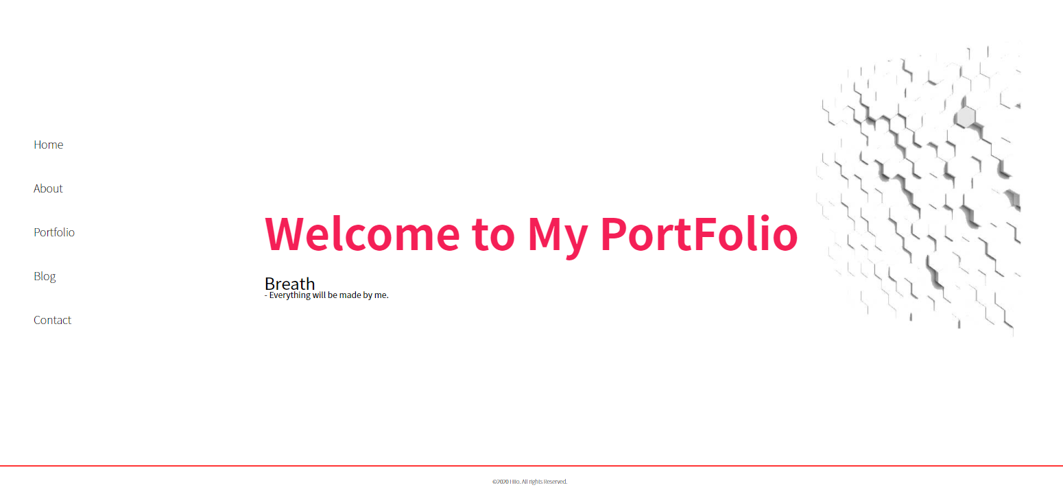
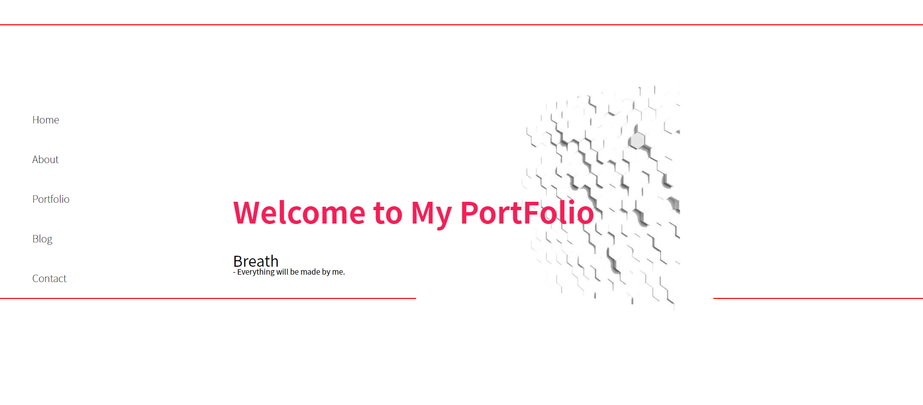
- 지금 제작하고 있는 포트폴리오 웹사이트의 경우 크기가 고정되어 있어, 모바일이나 태블릿 환경에서는 웹페이지가 잘리게 됩니다.
- 기존의 css코드를 %, vw, vh 등을 사용해서 media query (미디어 쿼리)를 사용해서 반응형으로 수정해 보겠습니다.
- 아래의 단계에 따라 진행해 보겠습니다.
단계 1. media.css 링크 / 태그 추가
2. 전체 페이지 크기 수정
3. 사이드 바 수정
4.사이드바 - 미디어 쿼리
5.사이드바 - jQeury
6.사이드바 - css 수정
1. media.css 링크 - 미디어 쿼리를 사용하는 법은 간단합니다.
@media (max-width:1440px) {
 	/* css 코드 */
}
- 각 디바이스의 크기와 미디어 쿼리의 분기점은 구글에 media queries breakpoint 로 검색하면 알 수 있습니다.
- 제가 사용할 분기점들의 목록은 아래의 링크를 참고 하여 가져왔습니다.
devfacts.com/media-queries-breakpoints-2020/
Media Queries Breakpoints For Responsive Design In 2020 - DevFacts
Learn how to write Media Queries Breakpoints for your web applications.Here you can find standared media qurie breakpoints in 2020.
devfacts.com
- css 파일에 위 코드를 추가해 주면 됩니다.
- 기존의 css파일에 추가해 줘도 되지만, media.css파일을 만들어 추가 해 주겠습니다.
- layout.html 에 <link>를 사용해 추가 해 주겠습니다.
- 모바일 환경에도 잘 적용 시키기 위해 <head>에 <meta<meta name="viewport"> 를 추가해주겠습니다.
<meta name="viewport" content="width=device-width, initial-scale=1.0">- 반응형 웹을 만들때는 모바일 기기에 맞춰 시작해 PC환경으로 크기를 맞추는 방법과 이 방법을 역으로 진행할 수 있습니다.
- 저는 PC환경에서 웹 페이지를 만든 후 max-width를 사용해 모바일 기기로 점점 페이지의 크기를 줄이는 방법을 이용해 보겠습니다.
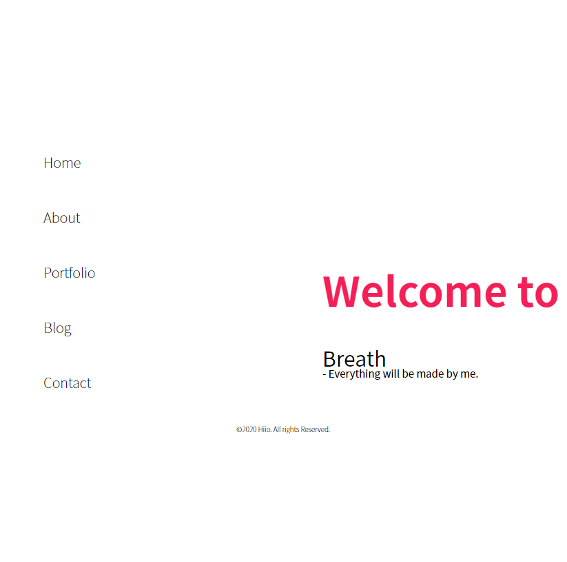
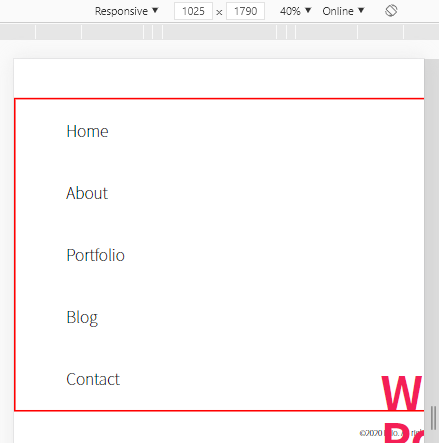
2. 전체 페이지 크기 수정 - 우선 기존의 페이지를 수정해 보겠습니다.
- 웹페이지의 컨텐츠들이 들어가는 main에 border크기를 지정해 현재 페이지가 어떻게 되어있는지 확인해 보겠습니다.
#main {
    margin: 0 auto;
    position: relative;
    width: 1440px;
    border:2px solid red;
}
- main이 박스 형태가 아닙니다. 높이 값이 지정되어 있지 않아 height가 0이라서 그렇습니다.
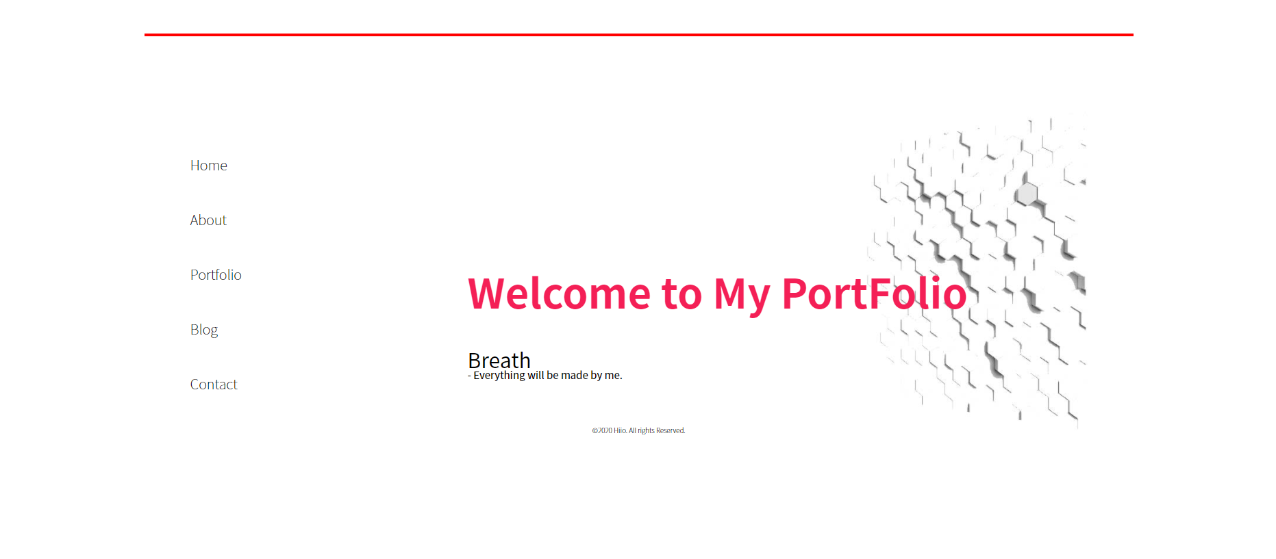
- main을 가운데 정렬 시켜 주기위해 margin :0 auto를 사용했습니다.
- 이제 main의 margin값을 삭제하고, 가로크기를 브라우저의 크기에 맞춰 주기 위해 100%를 설정한뒤 왼쪽으로 정렬 시켜 주겠습니다.
#main {
    float: left;
    position: relative;
    width: 100%;
}
- main 크기가 변경 되면서 안에 있는 컨텐츠 들이 위치가 변경 되었습니다.
- 이제 하나씩 수정을 해 보겠습니다.
3. 사이드 바 수정
- 먼저 각 페이지에 공통 적으로 들어가는 사이드 바을 수정해 주겠습니다.
#sidebar {
    float: left;
    width: 200px;
    margin-top: 150px;
}
- magin 값을 삭제 처리 합니다.
- 다른 컨텐츠들은 차후에 진행하므로 우선은 사이드바에 초점을 맞춰 진행해 보겠습니다.
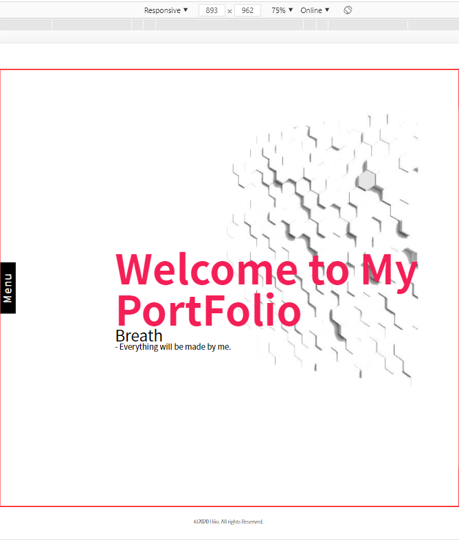
- 사이드 바의 크기는 고정되어 있기때문에 브라우저의 크기가 줄어들어도 크기나 위치가 변하지 않습니다.
- 미디어 쿼리 분기점을 통해서 브라우저의 크기가 줄어들게 되면 사이드바의 디자인이 변경되게 해줍니다.
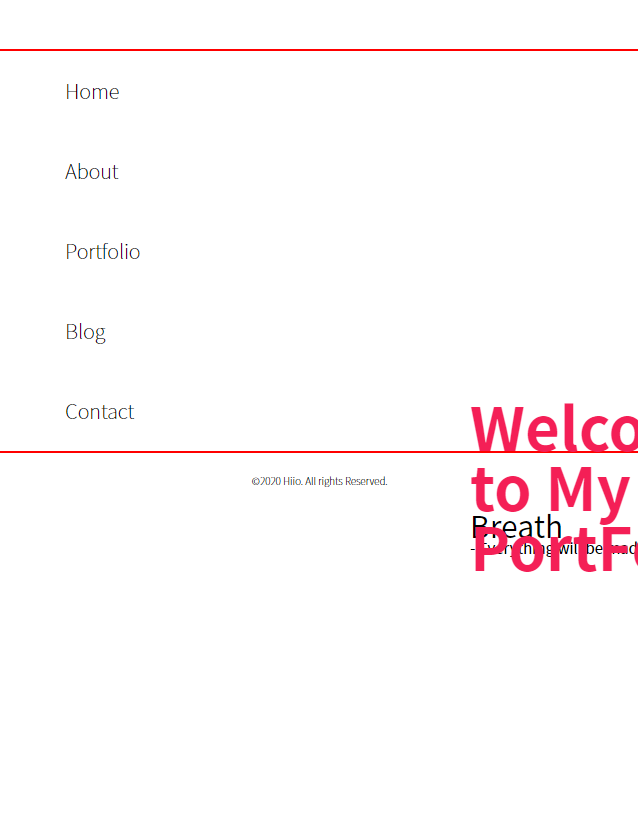
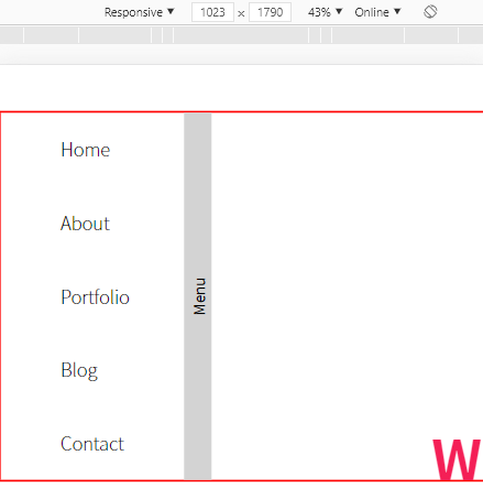
- 크기가 1024px 미만이 되면 사이드바가 왼쪽으로 사라지고 메뉴 탭이 생기도록 하겠습니다.
4.사이드바 - 미디어 쿼리 - 미디어 쿼리를 만들기 전에 태그 추가와 css수정을 해줘야합니다.
- layout.html에 nav태그 밑에 div.menu 태그를 추가 해 줍니다.
<div class="menu">
	<span>
		Menu
	</span>
</div>
- #sidebar의 width와 height를 삭제해주고 display : flex를 추가합니다.
- display flex를 추가하면 부모의 높이가 자식들에 의해 지정되면 높이가 지정되지 않은 자식들의 높이는 부모의 높이에 자동으로 지정되게 됩니다.
#sidebar {
    position: absolute;
    float: left;
    display: flex;
}
- 이제 .menu와 .menu>span스타일을 아래의 코드처럼 지정해 주겠습니다.
.menu {
    float: left;
    width: 30px;
    height: inherit;
    background-color: lightgray;
}

.menu > span{
    display: inline-block;
    position: relative;
    top: 50%;
    left: 50%;
    transform: translate(-50%,-50%) rotate(270deg);

}
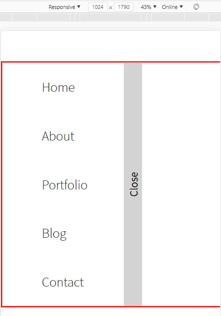
- Menu 부분이 새로 생겼네요.
- 이제 브라우저의 크기가 변경되면 Menu가 생기고 사라지게 해주겠습니다.
- 우선은 .menu에 display:none;을 추가해 줍니다.
.menu {
    float: left;
    width: 30px;
    height: inherit;
    background-color: lightgray;
    display: none;
}
- media.css에 max-width:1023.99px 인 분기점을 만들어 줍니다.
@media (max-width:1023px) {

}
- 중가로 안에 css 코드를 작성해 주면 됩니다.
- 선택자로 .menu 선택한 후 display:block을 추가합니다.
@media (max-width:1023px) {

    .menu{
        display: block;
    }
}
- 가로의 크기에 따라 변하는 것을 볼 수 있습니다.
- 이제 크기가 줄어 들면 사이드바의 nav부분이 왼쪽으로 사라지게 만들어 줍니다.
- 미디어 쿼리 #sidebar에 아래의 코드를 추가해 줍니다.
@media (max-width:1023px) {
    #sidebar{
        left: -200px;
    }
    .menu{
        display: block;
    }
}
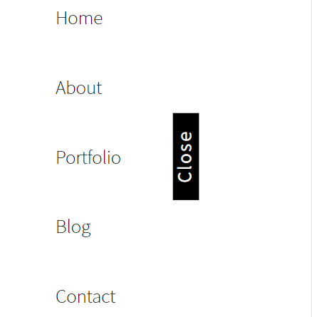
- 이제 .menu 를 클릭하면 사이드 바가 나오게 만들어 주기위해 js파일에 코드를 추가해 주겠습니다.
5. 사이드바 - jQuery - common.js에 click을 이용해 Menu클릭시 사이드바가 나타나겠끔 해줍니다.
$('.menu').click(function(){

       $('#sidebar').css({
           'left':'0'
       })


    });
- .menu 클릭시 #sidebar 의 left값을 0으로 만들어 주면 sidebar의 위치가 바뀌면서 나타나게 됩니다.
- 다시 .menu 클릭시 사라져야 합니다.
- 위 기능을 추가하기 위해 .menu의 class 에 show를 추가 해 줍니다.
- 그리고 jQuery 코드를 아래와 같이 수정해 줍니다.
$(document).on("click",".show",function () {
        $('#sidebar').css({
            'transition':'0.8s',
            'left': '0'
        });
        $('.menu').removeClass('show');
        $('.menu').addClass('hide');
        $('.menu').empty();
        $('.menu').append('<span>Close<span>');

    });

    $(document).on("click",".hide",function () {
        $('#sidebar').css({
            'transition':'0.8s',
            'left': '-200px'
        });
        $('.menu').removeClass('hide');
        $('.menu').addClass('show');
        $('.menu').empty();
        $('.menu').append('<span>Menu<span>');

    });
- 동적으로 생성된 선택자를 클릭하면 작동이 안할 경우가 있습니다.
- 이때 .click 이 아닌 $(document).on("click",선택자,function(){})을 사용하면 해결됩니다.
- show를 클릭하면 사이드바가 나타나고, show class를 삭제 hide를 추가하고 Menu 텍스트를 Close로 바꿔 줍니다.
- 사이드바를 닫을때는 반대로 작동합니다.
6. 사이드바 - css 수정 - 사이드 바의 Menu / Close 부분이 썩 마음에 들지 않습니다.
- css를 수정해 스타일을 바꿔주겠습니다.
- Menu / Close 텍스트 클릭시 nav사 나타나게 하기 위해서 .menu 에 추가해줬던 show hide를 span으로 옯겨 주기위해서 코드들을 아래와 같이 수정합니다.
- layout.html
            <div class="menu">
                <span class="show">
                    Menu
                </span>
            </div>
- common.js
$(document).on("click", ".show", function () {
        $('#sidebar').css({
            'left': '0'
        });
        $('.move').css({
            'left': '30vw'
        });
        $('.menu').empty();
        $('.menu').append('<span class="hide">Close<span>');

    });

    $(document).on("click", ".hide", function () {

        $('#sidebar').css({
            'left': '-200px'
        });
        $('.move').css({
            'left': '18vw'
        });
        $('.menu').empty();
        $('.menu').append('<span class="show">Menu<span>');

    });

    $(window).resize(function () {
        var width = $(window).width();
        if (width >= 1024) {
            $('#sidebar').css({
                'left': '0'
            });
            $('.menu').css({
               'display':'none'
            });
        } else {
            $('#sidebar').css({
                'left': '-200px'

            });
            $('.menu').css({
               'display':'block'
            });
        }
    });
- style.css
#sidebar {
    float: left;
    display: flex;
    position: fixed;
    top: 50vh;
    transform: translate(0, -50%);
    z-index: 10;
}

nav {
    float: left;
    width: 200px;
    transition: 0.4s linear;
}

.menu {
    float: left;
    width: 3vw;
    height: inherit;
    display: none;
}

.menu > span {
    display: inline-block;
    position: relative;
    top: 50%;
    left: 50%;
    color: white;
    background-color: black;
    text-align: center;
    width: 12vw;
    height: 4vw;
    font-size: 2vw;
    line-height: 4vw;
    letter-spacing: 0.3vw;
    transform: translate(-50%, -50%) rotate(270deg);
    cursor: pointer;
}
- 사이드바의 스타일과 기능을 추가 해줬습니다.
- 다음 포스팅에서는 index 페이지에 있는 이미지와 텍스트 content를 수정해 주겠습니다.